Logo
The idea behind this logo was to create a distinct graphic that combines elements of water with elements taken from Pacific University's main Boxer Head logo.
Primary logo

Secondary logos

Colors
The colors chosen for this project further reflect the combination of the existing Pacific University brand and elements of water.
Primary Colors
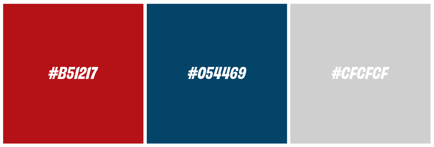
Secondary Colors

Typography
The brand uses a combination of two sans serif fonts to convey clarity and approachability.


Obviously Narrow Bold Italic is used for titles and headlines. It displays a sense of strength and reflects the forward movement of a swimmer in the water.
For body text, Mr. Eaves Mod OT Book offers a clean, modern tone that provides clarity and a confident feel to the brand.
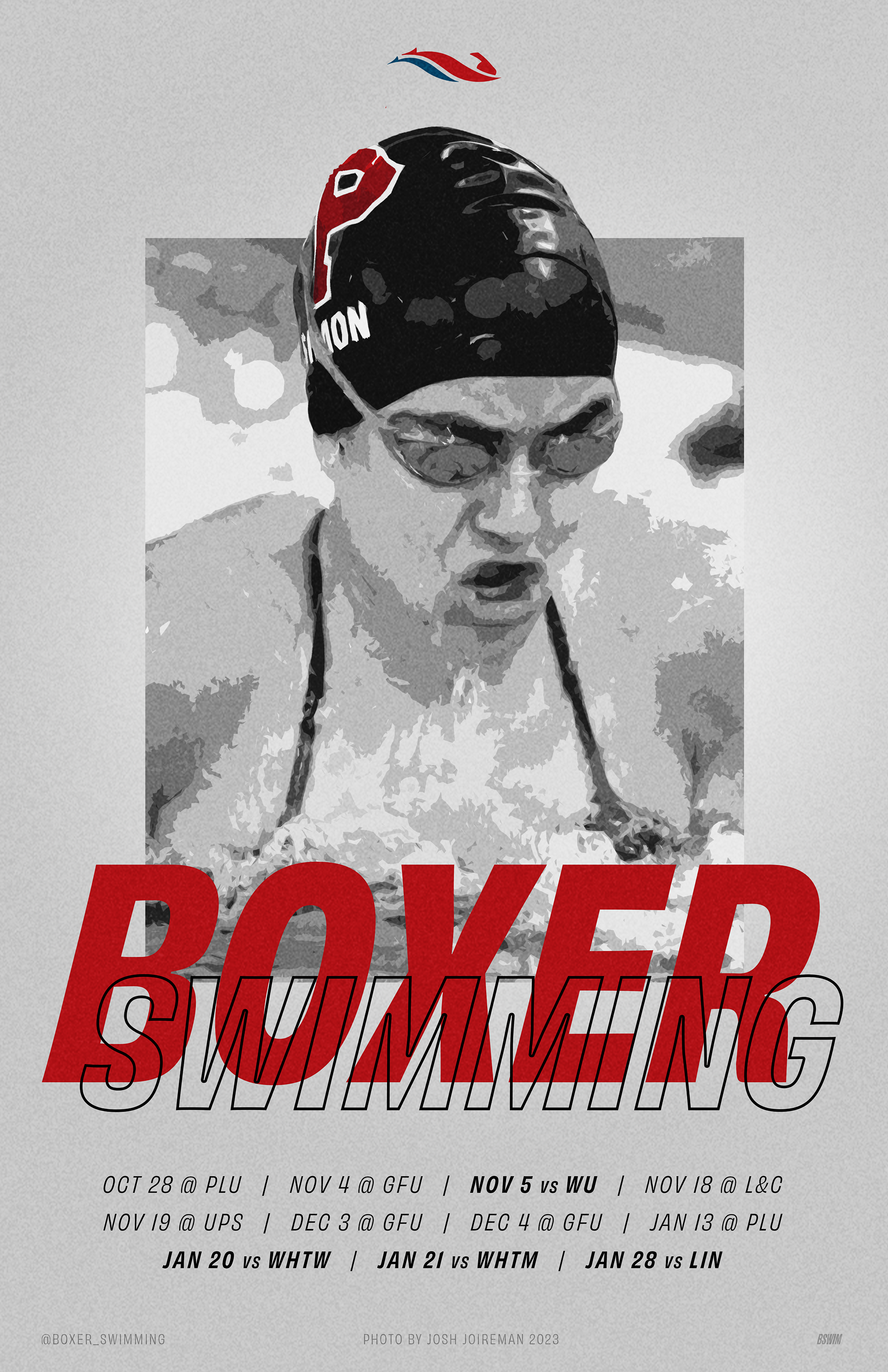
Applications